Posted by jc-Qualitystreet on 2011/04/20
Activity #3 of the Agile UX practitioner…
The Agile UX practitioner shares with the team his knowledge of the design principles and User Interface patterns …
This is a daily activity for the AGILE UX PRACTIONNER. It consists in fostering learning on users’ cognitive processes (learning, perception, memory, problem solving…), design principles… and continuously making the focus on User Centered Design, via deliverables and above all collaborative workshops, both with development and business teams.
This list of 11 principles of interface design is a good starting point:
Leading users through an interaction, guiding them through the accomplishment of specific tasks, indicating the possible actions that can be taken or just informing them about their context

Enabling easy reading and fostering a good understanding of what is displayed on the screen: the physiological process of reading but also the understanding of what is read.

Principle # 3: Grouping
Establishing and visually reinforcing structure and relationships, providing functional groupings of associated elements.
Principle # 4: Direct Feedback
Giving immediate and appropriate feedback, keeping the user informed of what’s happening.

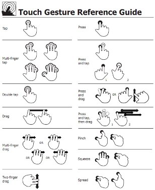
Principle #5: User Control
Always enabling the user control over the actions of the system, the dialogue and interactions.

Principle #6: Simplicity
Ensuring conciseness, minimizing interface complexity, offering the proper amount of information and relevant functionalities.

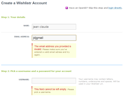
Principle # 7: Error Management
Preventing user errors, helping to manage when they occur (reduction and recovery), providing good error messages.

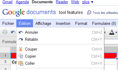
Principle # 8: Flexibility
Adapting to the characteristics or specific needs of the users (views, preferences…), providing accelerators and allowing interface customization.

Principle # 9: Consistency
Providing the user with a stable framework – navigation, interactions, language, styles, appearance, procedural usage… – in similar contexts.

Principle #10: Significance & Meaningfulness
Speaking the user language, fostering simple and natural dialogue, using meaningful illustrations.

Principle #11: Compatibility
Adapt to the procedures, activities or characteristics of the users, designing for mental models, but also taking into account standards and conventions of identical contexts and situations.

Posted by jc-Qualitystreet on 2011/02/17
Whether to progress one step ahead of the implementation by preparing and designing « just in time » contents of next iterations or to collaborate actively with developers on the functions that must be delivered during the sprint, one of the main activity of the AGILE UX PRACTIONNER consists in sharing with the team his knowledge of the design principles and User Interface patterns…
Legibility? Readability?
It consists in enabling easy reading and fostering a good understanding of what is displayed on the screen. This principle covers two dimensions: the physiological process of reading but also the understanding of what is read.
Make it legible: information is noticeable and distinguishable
Make it readable: information is identifiable, interpretable and attractive: it can be understood!

Legible, readable and attractive !
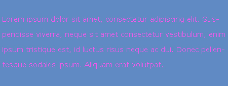
This UI principle refers to the lexical characteristics of the information displayed on the screen that can impede or facilitate the reading of this information (character brightness, contrast between the letter and the background, font size, interword spacing, text blocks, line spacing, paragraph spacing, line length…).
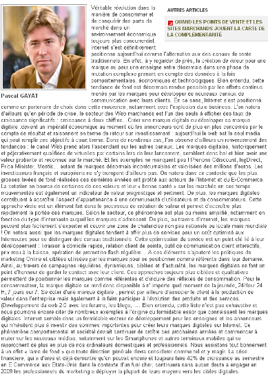
Small font size and low contrast between text and background are hard to read and often constitute the main users’ complaints. Accessibility issues and who will need to read the content need also to be taken into account.
Two bad examples…

Very bad contrast!

So hard to read !
But also very good practices…
Example

And the winner is...
Example

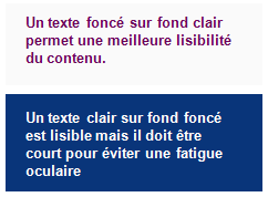
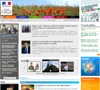
Legible and readable content. Good contrast. Good blocks.
Example

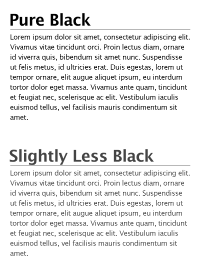
In both cases legible but sweeter and less visual "fatigue" with the grey version (for an interface used every day)
And finally some guidelines…
- Use simple, common, and familiar fonts (sans serif font such as Verdana, Arial or Helvetica), designed for reading on screen
- Use Mixed-Case for Prose Text
- Avoid texts in all caps
- Don’t overuse bold: use it only when you want to call attention or create a hierarchy
- Use italics when you want to call attention
- Use an underline only to indicate a navigation link
- For line spacing use one to one and one-half times font size
- For Web pages use 12 to 14 points for body text and 18 to 36 points for titles and headings
- Present black text on plain, high-contrast backgrounds.
- Ensure the readability of the text by adjusting the contrast with the background (contrast value of at least 80%)
- On a light background (white / gray), avoid yellow, pale green or cyan, blue, red, purple
- Use line lengths of about 75-100 characters if fast reading is required
- Left-justify text
- Use lists to present facts.
- Make text scannable by using Bulleted listings, Tables, Headings and subheadings, Highlighted and emphasized important issues, short paragraphs
Posted by jc-Qualitystreet on 2011/02/16
Whether to progress one step ahead of the implementation by preparing and designing “just in time” contents of next iterations or to collaborate actively with developers on the functions that must be delivered during the sprint, one of the main activity of the AGILE UX PRACTIONNER consists in sharing with the team his knowledge of the design principles and User Interface patterns…
Visibility and Invitation ?
This first principle refers to the means (prompts and cues) available to lead users through an interaction, guide them through the accomplishment of specific tasks, indicate the possible actions that can be taken or just inform them about their context.
Presenting an appealing first impression and providing « just enough » invitations to the user are two of the keys to successful interactive interfaces. It ensures ease of use, ease of learning and global satisfaction. Nowdays, in the era of digital marketing, invitations are often reinforced and extended to persuasive design: the art to motivate users to view some specific content or take some action (through visual and verbal webdesign and patway optimization).

Call to actions, invitation and persuasive design
Clear pathways to information, call to action elements, short instructions, simple and appropriate information architecture, breadcrumb trails, progress indicator, various information visualization mechanisms, are all promoters of good visibility and performing invitation.
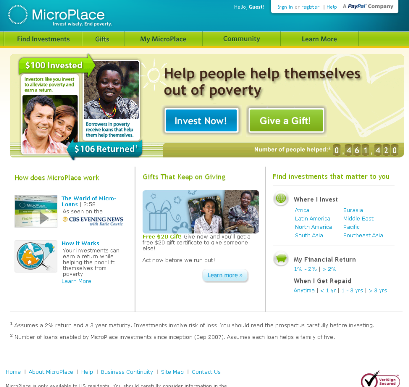
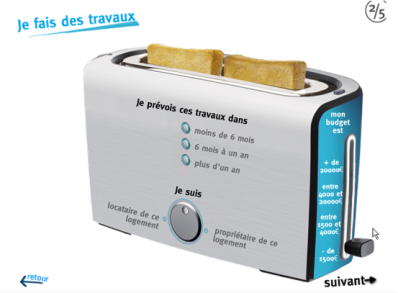
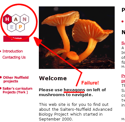
Two bad examples:

Where do I start ? How does it work?

Not so obvious 🙂
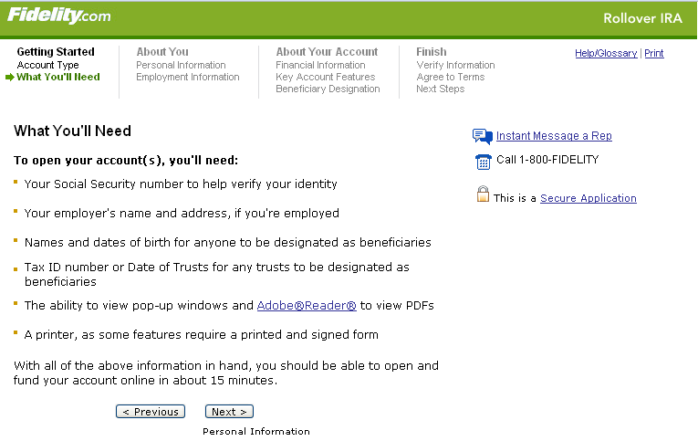
But also good practices:
Example:

Appropriate and useful step navigation
Example:

A very good invitation
Example:

Good invitation
Example:

Default and limited choices
Example:

Straight to the point !
Example:

Follow the guide !
And finally some guidelines…
- Limit entry points on the interface
- Make the entry points descriptive and « task-oriented »
- Provide an ordering of screen information and elements that is rhythmic, guiding a person’s eye through the display, encourages natural movement sequences, and minimizes pointer and eye movement distances
- Highlight important page items that require user attention
- Use location and highlighting to prioritize pushbutton
- Establish levels of importance
- Use color to draw attention
- Propose a short, unique, descriptive and meaningful title on each page
- Provide on each page navigational elements allowing users to answer three questions: Where am I? What’s here? Where can I go from here?
- Don’t overload users with too many alternatives or don’t confuse them with unneeded information
- Ensure the main navigation system provides a visual indication to the user what menu item or it is
- Clearly and prominently communicate the purpose and value of the Web site on the homepage
- Put the most important items at the top center of the Web page to facilitate users’ finding the information
- Do not create or direct users into pages that have no navigational options
- …


![]()

