Posted by jc-Qualitystreet on 2011/02/17
Whether to progress one step ahead of the implementation by preparing and designing « just in time » contents of next iterations or to collaborate actively with developers on the functions that must be delivered during the sprint, one of the main activity of the AGILE UX PRACTIONNER consists in sharing with the team his knowledge of the design principles and User Interface patterns…
Legibility? Readability?
It consists in enabling easy reading and fostering a good understanding of what is displayed on the screen. This principle covers two dimensions: the physiological process of reading but also the understanding of what is read.
Make it legible: information is noticeable and distinguishable
Make it readable: information is identifiable, interpretable and attractive: it can be understood!

Legible, readable and attractive !
This UI principle refers to the lexical characteristics of the information displayed on the screen that can impede or facilitate the reading of this information (character brightness, contrast between the letter and the background, font size, interword spacing, text blocks, line spacing, paragraph spacing, line length…).
Small font size and low contrast between text and background are hard to read and often constitute the main users’ complaints. Accessibility issues and who will need to read the content need also to be taken into account.
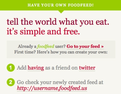
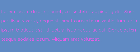
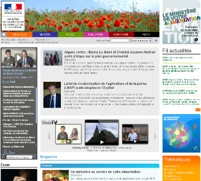
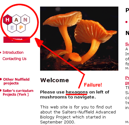
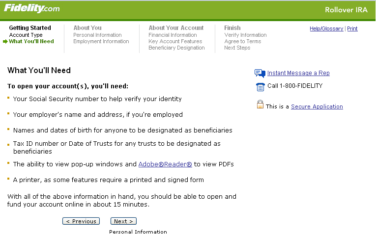
Two bad examples…

Very bad contrast!

So hard to read !
But also very good practices…
Example

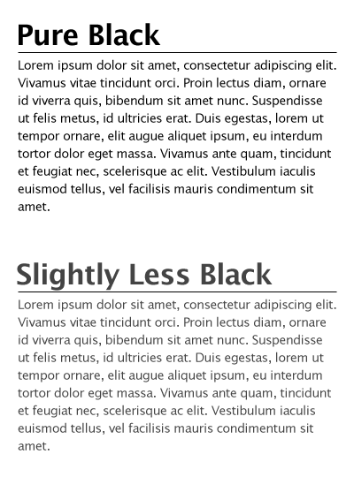
And the winner is...
Example

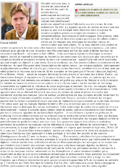
Legible and readable content. Good contrast. Good blocks.
Example

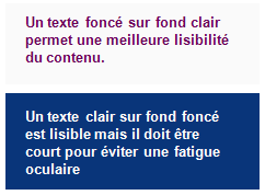
In both cases legible but sweeter and less visual "fatigue" with the grey version (for an interface used every day)
And finally some guidelines…
- Use simple, common, and familiar fonts (sans serif font such as Verdana, Arial or Helvetica), designed for reading on screen
- Use Mixed-Case for Prose Text
- Avoid texts in all caps
- Don’t overuse bold: use it only when you want to call attention or create a hierarchy
- Use italics when you want to call attention
- Use an underline only to indicate a navigation link
- For line spacing use one to one and one-half times font size
- For Web pages use 12 to 14 points for body text and 18 to 36 points for titles and headings
- Present black text on plain, high-contrast backgrounds.
- Ensure the readability of the text by adjusting the contrast with the background (contrast value of at least 80%)
- On a light background (white / gray), avoid yellow, pale green or cyan, blue, red, purple
- Use line lengths of about 75-100 characters if fast reading is required
- Left-justify text
- Use lists to present facts.
- Make text scannable by using Bulleted listings, Tables, Headings and subheadings, Highlighted and emphasized important issues, short paragraphs
Posted by jc-Qualitystreet on 2011/02/16
Whether to progress one step ahead of the implementation by preparing and designing “just in time” contents of next iterations or to collaborate actively with developers on the functions that must be delivered during the sprint, one of the main activity of the AGILE UX PRACTIONNER consists in sharing with the team his knowledge of the design principles and User Interface patterns…
Visibility and Invitation ?
This first principle refers to the means (prompts and cues) available to lead users through an interaction, guide them through the accomplishment of specific tasks, indicate the possible actions that can be taken or just inform them about their context.
Presenting an appealing first impression and providing « just enough » invitations to the user are two of the keys to successful interactive interfaces. It ensures ease of use, ease of learning and global satisfaction. Nowdays, in the era of digital marketing, invitations are often reinforced and extended to persuasive design: the art to motivate users to view some specific content or take some action (through visual and verbal webdesign and patway optimization).

Call to actions, invitation and persuasive design
Clear pathways to information, call to action elements, short instructions, simple and appropriate information architecture, breadcrumb trails, progress indicator, various information visualization mechanisms, are all promoters of good visibility and performing invitation.
Two bad examples:

Where do I start ? How does it work?

Not so obvious 🙂
But also good practices:
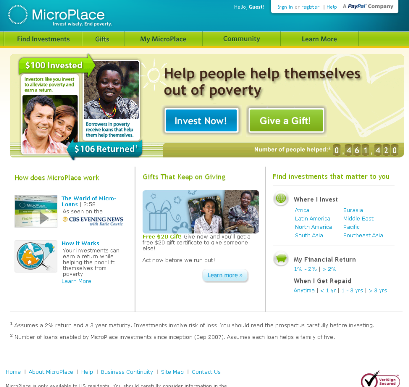
Example:

Appropriate and useful step navigation
Example:

A very good invitation
Example:

Good invitation
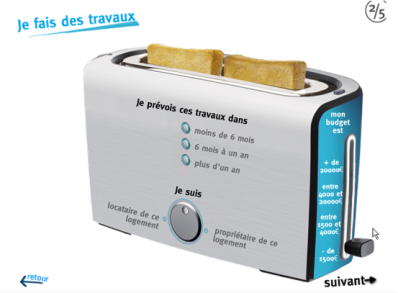
Example:

Default and limited choices
Example:

Straight to the point !
Example:

Follow the guide !
And finally some guidelines…
- Limit entry points on the interface
- Make the entry points descriptive and « task-oriented »
- Provide an ordering of screen information and elements that is rhythmic, guiding a person’s eye through the display, encourages natural movement sequences, and minimizes pointer and eye movement distances
- Highlight important page items that require user attention
- Use location and highlighting to prioritize pushbutton
- Establish levels of importance
- Use color to draw attention
- Propose a short, unique, descriptive and meaningful title on each page
- Provide on each page navigational elements allowing users to answer three questions: Where am I? What’s here? Where can I go from here?
- Don’t overload users with too many alternatives or don’t confuse them with unneeded information
- Ensure the main navigation system provides a visual indication to the user what menu item or it is
- Clearly and prominently communicate the purpose and value of the Web site on the homepage
- Put the most important items at the top center of the Web page to facilitate users’ finding the information
- Do not create or direct users into pages that have no navigational options
- …
Posted by jc-Qualitystreet on 2011/01/21

A very good ROTI given by the participants!
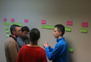
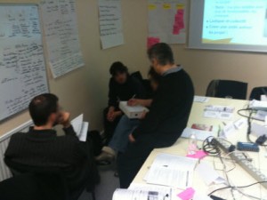
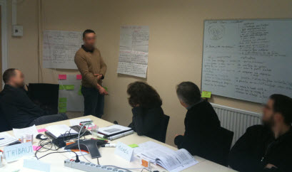
User Story Mapping, Vision, Personas, Specifications Workshops, Guerilla Usability and more … all the activities of the Agile UX practitioner during these two days of training.

User Story Mapping Workshop
the opportunity for participants to return to foundations (both Agile and UX) but also to learn new techniques, new practices …

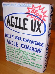
Product Vision Box Workshop

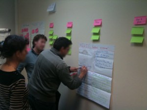
Participant introducing a "pragmatic" persona: Raoul !
the opportunity for a heterogeneous group, composed of 7 Agilists and 3 Usability consultants, to discover each other, learn to work together and ultimately find that Agile UX collaboration works!

"Regis": a pragmatic Persona under collective construction
In short a great class and a real pleasure to do the training !
More information on this training session (in french)
Posted by jc-Qualitystreet on 2010/11/21
Agile development and user experience can work brillantly together… well, but how?
Even if the effort related to Agile User Experience (Agile UX) continues throughout the project (with « just in time » designing and user testing) the User Experience foundations must be initiated at the very beginning of the project, during the first sprints.
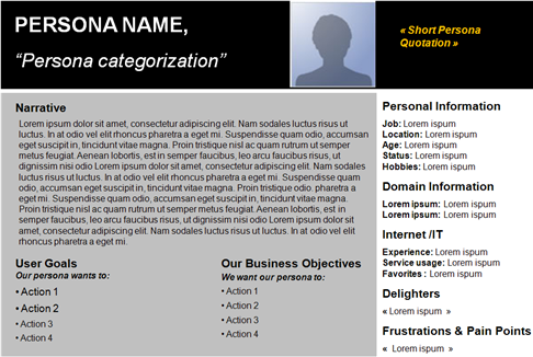
Starting to define the Product vision is a best practice. Key element of the vision, the PERSONAS (a fictional representation of target users you can use to help guide decisions about product, features, navigation, visual design…) have also the precious advantage to be directly linked to USER STORIES (brief description of functionality as viewed by the user and an essential agile artifact).

A persona template
First sprints are also the best moment to create a coherent vision of the User Interface structure, and to establish first Usability guidelines (then UI patterns), two elements that will enable UX specialists to maintain a consistent user interface across features and regular deliveries.
Once the product vision and posture established, the target users defined and the product backlog (list of all functionality desired) initiated, user experience of the application will continue just in time, sprint after sprint, following the iterative and incremental lifecycle.
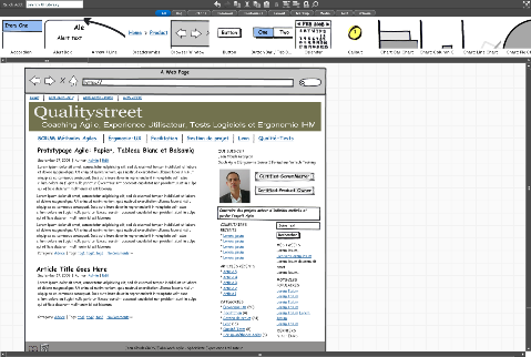
Trust and collaboration are the keys, and UX practitioners MUST BE collocated with development team: visual artifacts, storyboards, mockups and wireframes, will serve the project and enable business and development teams to build the best user experience.

Wireframe with balsamiq: quick, easy and collaborative
But agile development lifecycle proposes new challenges and requires managing User Experience differently…
Practice #1
Support user representatives or business teams (Product Owner) in their analysis, specification and prioritization effort…
UX specialist is the user advocate but also Product Owner partner as well as a team member.
Practice #2
Do just enough user Research, user modeling and UI design up front

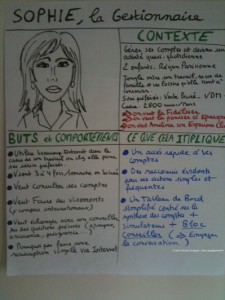
The Agile Persona : quick and easy
Practice #3
Adapt your collaboration with teams during a sprint:
- Progress one step ahead of the implementation by preparing and designing « just in time » contents of next iterations (sprint+1, sprint+2)
- Collaborate actively with developers on the functions that must be delivered at the end of the current sprint
- Evaluate with end users results of the previous sprint (sprint-1)
Practice #4
Consider feedback differently: direct, less formal, more frequent and more reactive both in the way to receive and to give it. Overuse face to face collaboration, guerilla usability testing and just enough reporting & documentation
Practice #5
Use rapid prototyping (effective wireframes) to foster collaboration and elicit rapid feedback. Make it valuable and adjusted to the context

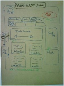
Paper prototyping ... from collaborative workshop
Practice #6
Be a facilitator and engage people (both business, development and end-users) on collaborative workshops to design and evaluate the system

Persona workshop
Anything else ?
Posted by jc-Qualitystreet on 2010/10/18
Larry Constantine is the co-author with Lucy Lockwood of « Software for Use » (1999), well-known in the HCI (Human Computer Interaction) field for his « Essential use cases technique » and his « Usage-centered design methodology ».
He wrote an article (part 1 and part 2) a month ago on Agile and Experience Design Marriage, with an introduction a bit provocative:
« when experience design is married with agile development, the results can be a crisis of faith on either or both sides »
In part 1, Larry insists on deep philosophical differences and variance in practices… As a UX practitioner and Agile Coach, involved in various agile projects, I unfortunately have to confirm some of his observations:
- Agile methods still don’t incorporate usability and UX practices
- Marriage is often « one way », experience designers accommodate to the dictates of agile methods and schedules, even if UX tend to become now the key differentiator in the IT marketplace.
- UX is not the key driver for development
- UX is still a lack in most agile projects
That said, I don’t agree with, what Larry Constantine calls « core incompatibilities » in the couple. What a negative approach!
Of course, « agile methods employ rapid, iterative refinement, with short, incremental development cycles« . And, yes, « they tend to favor a functionality-first, inside-out process, beginning with early and easy successes that deliver working code« . So what? Is it so incompatible with user experience and usability techniques? I don’t think so!
Rapid prototyping, Guerilla usability testing, Personas and just enough user research, innovation games, Vision or Design workshops are examples of fabulous UX & Usability techniques. They can be effectively applied within agile development cycles.
I rather see the iterative and incremental development as an opportunity to gather, at frequent intervals, feedback… real feedback… rich feedback. Receiving feedback from the team, the customer or of course the users is, according to me the most important element on IT projects.
Time to market, value and simplicity are now crucial for most organizations evolving in a highly competitive environment. It is both a reality that UX specialists need to understand and a strength that lead them to focus only on valuable activities. And I am really convinced that we need to adapt our approach, our tools and deliverables for more effective collaboration with other actors involved in IT projects (not only agile…).
In part 2, Larry Constantine described in detailed the key ingredients to make a better marriage between Experience Design and Agile Development…
- Respect of each other’s work and skills (I personaly think we’re all professionals)
- Equality in the development process (I personaly think User Interface Design should be considered as an essential prioritization criterion of the product backlog !
- Knowledge about each other’s skills and areas of expertise… to get respect and equality (I personaly think learning is a key whatever the context !)
- Independence though but coordinated activity
… A more optimistic view that I appreciate. I also like his conclusion:
« Now, may your union be a long and prosperous one! »
