Posted by jc-Qualitystreet on 2011/02/22
…that is all you need to work effectively!
The mockup activity (or prototyping) is part of a user-centered design approach. And the « Wireframe » has become over the years one of the most favorite artifact of User Experience specialists to communicate a concept, verify design assumptions and testing various options or validate ideas and usability decisions …

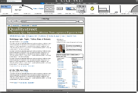
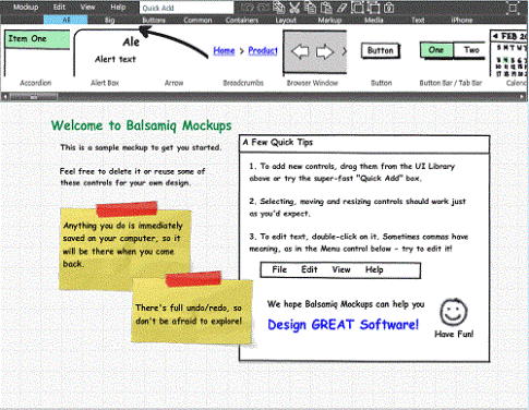
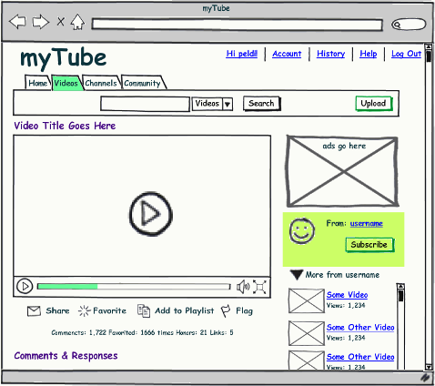
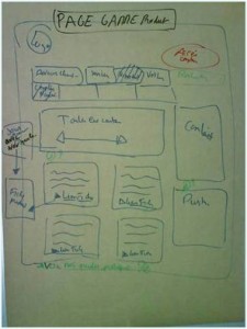
Example of wireframe with Balsamiq: my french blog
Wireframe: the real issues
A wireframe is a « low fidelity » prototype. This non-graphical artifact shows the skeleton of a screen, representing its structure and basic layout. It contains and localizes contents, features, navigation tools and interactions available to the user.
The wireframe is usually:
- black and white,
- accompanied by some annotations to describe the behavior of the elements (default or expected states, error cases, values, content source…), their relationships and their importance,
- often put in context within a storyboard (a sequence of screens in a key scenario)
- refined again and again
- used as a communication tool serving as an element of conversation and confirmation of « agile » user stories
Various tools can be used to create wireframes (with different format and level of fidelity), from the simplest to the most sophisticated ones, free or not…
Just enough is the best…
I’ve seen too many projects (led by traditional development methods) in which a wireframe was one of the numerous artifacts of the project, just additional documentation, created solitary by a single person, aiming at replacing dialogue and conversation between people. What a waste…
But I’m also always amazed when I intervene on a agile project as a coach to observe that wireframes are rarely used. Moreover, design & specifications workshops, interactions, conversations, feedbacks between Product Owner and team are not effective, partially or not done. What a waste…
The winner of the « the best prototyping tool award » is actually… a Trio!
The real strength of the wireframe lies in its ability:
- to be a communication tool, used during a workshop to facilitate discussion with developers, testers and business actors (Product Owner).
- to be created collaboratively, in order to enable everyone on a team to have a shared picture ,
So, wireframes help to generate feedback, to see potential problems with an interface and to clarify conditions of satisfaction.
For these reasons, simple PAPER PROTOTYPING done collectively,
quick collaborative wireframes on the WHITEBOARD,
and rapid sketching activities with BALSAMIQ,
are by far the most effective.
On Agile projects (with short sprint lasting 2 or 3 weeks), this is not only an option! Rapid and valuable prototyping in order to foster collaboration and elicit rapid feedback is a must.
Exploring, illustrating and understanding ust enough, just in time… wireframes should be adjusted in terms of scope, details, timing and level of fidelity with a special focus on feedback, collaboration and interactions. This is probably the reason why I abandoned tools like Microsoft Visio and PowerPoint or Axure RP Pro or PowerPoint that have long been my preference but which are mostly inappropriate in the Agile contexts …
Paper Prototyping
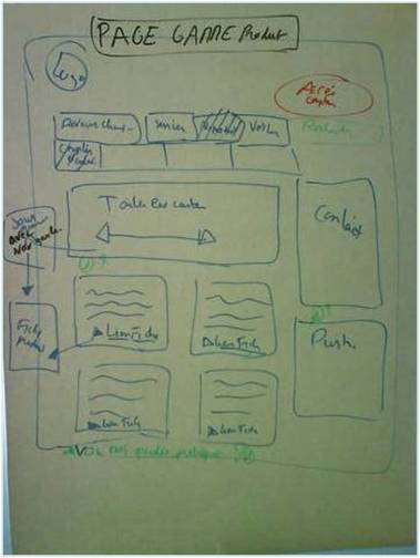
Paper prototyping is probably the fastest and easiest form of wireframes but not the least effective. Direct, simple, visual, cheap, enabling rich feedback, paper wireframes focus above all on collaboration and proximity.

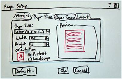
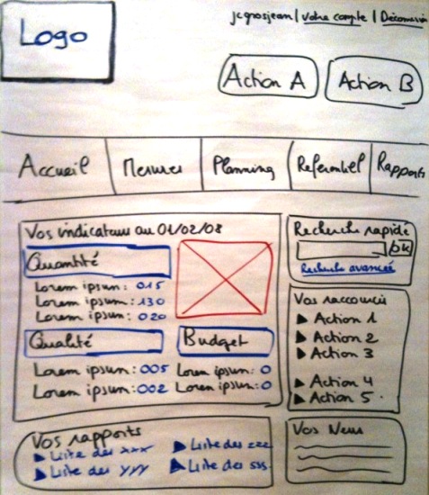
Paper (sketch): easy to create a low-fidelity wireframe
Complexity of the format varies from one context to another, as highly developed paper prototypes can be created with proper equipment, good preparation and facilitation. Interactive paper prototyping sessions offer other benefits: direct manipulation, interactivity, playfulness and creativity.

Paper prototyping
Larger collaborative workshops (focus on prototyping) can be very valuable both for design and testing activities.

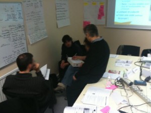
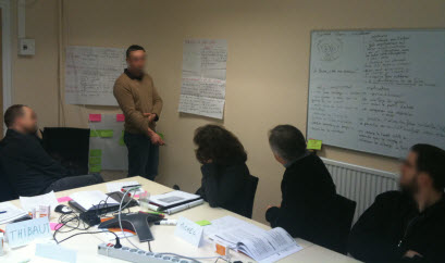
Design workshop. We divided the group into sub-groups (45 minutes preparation for the first round - 15 minutes presentation)
Simplicity is both a value and a strong principle of agility. Paper prototyping is a solid practice of Agile teams

UI paper
Witheboard: just in time, just enough…
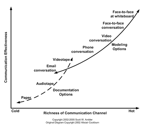
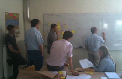
Teamwork on the whiteboard is one of the most efficient form of communication.

Communication Modes Effectiveness - Scott Ambler
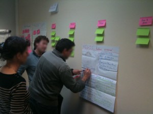
Collaborative specifications workshops around the whiteboard are intense and highly valuable:
- they create a collective dynamic leading to a stronger decision
- they are a incredible source of discovery and creativity
- they are interactive, playful, never boring
- they focus on visual and touch through direct manipulation

Several specifications workshops take place during an agile sprint.
Some are dedicated to the scope (user stories) of the current sprint; other (also called Product Backlog refinement) serve to explore, refine, model collectively user stories envisioned for the next sprint. Some teams I coach organize this specification workshop, just in time, the last day of the current sprint (i.e. Friday afternoon) after the Sprint review & Retrospective in order to be ready for the Monday sprint planning.
Other teams organize it in the middle of the sprint in order to have time for requirement exploration, testing, business modeling or quick user research….

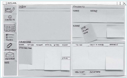
Whiteboard prototyping
Design & specification workshops give the necessary context and conversational elements so crucial to User Stories. They enable to illustrate and clarify the conditions of satisfaction while delivering valuable examples.
Take a picture of the results with you camera, and you have a useful element to associate with your user story description written in the wiki!
Balsamiq Mockups
Balsamiq is an electronic tool that I recommend to agile teams (complementary with paper and whitebooard). Easy to use and allowing very rapid sketching, the application presents a large library of UI components (build-in and from the users’ community), many templates, export possibilities and precious plugins for Confluence or Jira users.

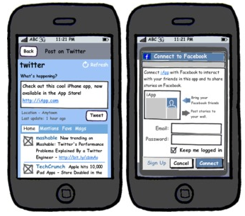
Example of wireframe with Balsamiq
I use the tool with several co-located team and in distributed contexts offshore via screen sharing: in both cases the contribution of the tool was welcomed by teams and Product Owners « a useful tool that serves human activities« .
The sketchy format also has its interest: it lets you focus design conversations on functionality. No risk to forget the reality!
You must focus on your working software deliveries to measure you project progress. Wireframe is a communication tool.

Balsamiq Mockups can be used to model any type of interface: web portal and websites, software application, mobile interfaces…

This is not a free tool but the price / quality ratio is excellent.
Posted by jc-Qualitystreet on 2011/02/17
Whether to progress one step ahead of the implementation by preparing and designing « just in time » contents of next iterations or to collaborate actively with developers on the functions that must be delivered during the sprint, one of the main activity of the AGILE UX PRACTIONNER consists in sharing with the team his knowledge of the design principles and User Interface patterns…
Legibility? Readability?
It consists in enabling easy reading and fostering a good understanding of what is displayed on the screen. This principle covers two dimensions: the physiological process of reading but also the understanding of what is read.
Make it legible: information is noticeable and distinguishable
Make it readable: information is identifiable, interpretable and attractive: it can be understood!

Legible, readable and attractive !
This UI principle refers to the lexical characteristics of the information displayed on the screen that can impede or facilitate the reading of this information (character brightness, contrast between the letter and the background, font size, interword spacing, text blocks, line spacing, paragraph spacing, line length…).
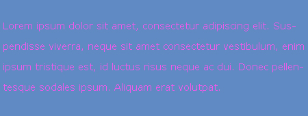
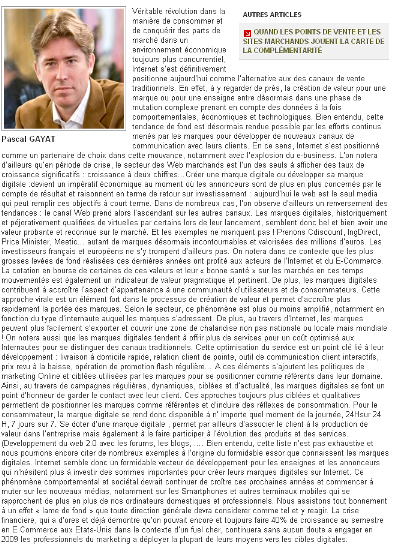
Small font size and low contrast between text and background are hard to read and often constitute the main users’ complaints. Accessibility issues and who will need to read the content need also to be taken into account.
Two bad examples…

Very bad contrast!

So hard to read !
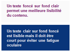
But also very good practices…
Example

And the winner is...
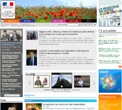
Example

Legible and readable content. Good contrast. Good blocks.
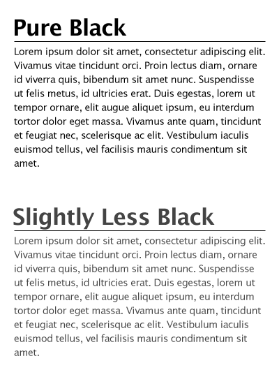
Example

In both cases legible but sweeter and less visual "fatigue" with the grey version (for an interface used every day)
And finally some guidelines…
- Use simple, common, and familiar fonts (sans serif font such as Verdana, Arial or Helvetica), designed for reading on screen
- Use Mixed-Case for Prose Text
- Avoid texts in all caps
- Don’t overuse bold: use it only when you want to call attention or create a hierarchy
- Use italics when you want to call attention
- Use an underline only to indicate a navigation link
- For line spacing use one to one and one-half times font size
- For Web pages use 12 to 14 points for body text and 18 to 36 points for titles and headings
- Present black text on plain, high-contrast backgrounds.
- Ensure the readability of the text by adjusting the contrast with the background (contrast value of at least 80%)
- On a light background (white / gray), avoid yellow, pale green or cyan, blue, red, purple
- Use line lengths of about 75-100 characters if fast reading is required
- Left-justify text
- Use lists to present facts.
- Make text scannable by using Bulleted listings, Tables, Headings and subheadings, Highlighted and emphasized important issues, short paragraphs
Posted by jc-Qualitystreet on 2011/02/16
Whether to progress one step ahead of the implementation by preparing and designing “just in time” contents of next iterations or to collaborate actively with developers on the functions that must be delivered during the sprint, one of the main activity of the AGILE UX PRACTIONNER consists in sharing with the team his knowledge of the design principles and User Interface patterns…
Visibility and Invitation ?
This first principle refers to the means (prompts and cues) available to lead users through an interaction, guide them through the accomplishment of specific tasks, indicate the possible actions that can be taken or just inform them about their context.
Presenting an appealing first impression and providing « just enough » invitations to the user are two of the keys to successful interactive interfaces. It ensures ease of use, ease of learning and global satisfaction. Nowdays, in the era of digital marketing, invitations are often reinforced and extended to persuasive design: the art to motivate users to view some specific content or take some action (through visual and verbal webdesign and patway optimization).

Call to actions, invitation and persuasive design
Clear pathways to information, call to action elements, short instructions, simple and appropriate information architecture, breadcrumb trails, progress indicator, various information visualization mechanisms, are all promoters of good visibility and performing invitation.
Two bad examples:

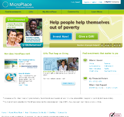
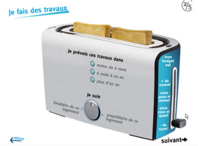
Where do I start ? How does it work?

Not so obvious 🙂
But also good practices:
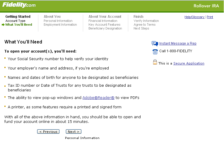
Example:

Appropriate and useful step navigation
Example:

A very good invitation
Example:

Good invitation
Example:

Default and limited choices
Example:

Straight to the point !
Example:

Follow the guide !
And finally some guidelines…
- Limit entry points on the interface
- Make the entry points descriptive and « task-oriented »
- Provide an ordering of screen information and elements that is rhythmic, guiding a person’s eye through the display, encourages natural movement sequences, and minimizes pointer and eye movement distances
- Highlight important page items that require user attention
- Use location and highlighting to prioritize pushbutton
- Establish levels of importance
- Use color to draw attention
- Propose a short, unique, descriptive and meaningful title on each page
- Provide on each page navigational elements allowing users to answer three questions: Where am I? What’s here? Where can I go from here?
- Don’t overload users with too many alternatives or don’t confuse them with unneeded information
- Ensure the main navigation system provides a visual indication to the user what menu item or it is
- Clearly and prominently communicate the purpose and value of the Web site on the homepage
- Put the most important items at the top center of the Web page to facilitate users’ finding the information
- Do not create or direct users into pages that have no navigational options
- …
Posted by jc-Qualitystreet on 2011/01/21

A very good ROTI given by the participants!
User Story Mapping, Vision, Personas, Specifications Workshops, Guerilla Usability and more … all the activities of the Agile UX practitioner during these two days of training.

User Story Mapping Workshop
the opportunity for participants to return to foundations (both Agile and UX) but also to learn new techniques, new practices …

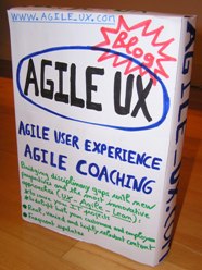
Product Vision Box Workshop

Participant introducing a "pragmatic" persona: Raoul !
the opportunity for a heterogeneous group, composed of 7 Agilists and 3 Usability consultants, to discover each other, learn to work together and ultimately find that Agile UX collaboration works!

"Regis": a pragmatic Persona under collective construction
In short a great class and a real pleasure to do the training !
More information on this training session (in french)
Posted by jc-Qualitystreet on 2010/11/21
Agile development and user experience can work brillantly together… well, but how?
Even if the effort related to Agile User Experience (Agile UX) continues throughout the project (with « just in time » designing and user testing) the User Experience foundations must be initiated at the very beginning of the project, during the first sprints.
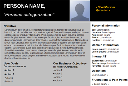
Starting to define the Product vision is a best practice. Key element of the vision, the PERSONAS (a fictional representation of target users you can use to help guide decisions about product, features, navigation, visual design…) have also the precious advantage to be directly linked to USER STORIES (brief description of functionality as viewed by the user and an essential agile artifact).

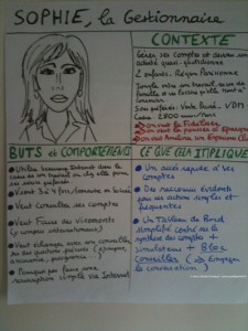
A persona template
First sprints are also the best moment to create a coherent vision of the User Interface structure, and to establish first Usability guidelines (then UI patterns), two elements that will enable UX specialists to maintain a consistent user interface across features and regular deliveries.
Once the product vision and posture established, the target users defined and the product backlog (list of all functionality desired) initiated, user experience of the application will continue just in time, sprint after sprint, following the iterative and incremental lifecycle.
Trust and collaboration are the keys, and UX practitioners MUST BE collocated with development team: visual artifacts, storyboards, mockups and wireframes, will serve the project and enable business and development teams to build the best user experience.

Wireframe with balsamiq: quick, easy and collaborative
But agile development lifecycle proposes new challenges and requires managing User Experience differently…
Practice #1
Support user representatives or business teams (Product Owner) in their analysis, specification and prioritization effort…
UX specialist is the user advocate but also Product Owner partner as well as a team member.
Practice #2
Do just enough user Research, user modeling and UI design up front

The Agile Persona : quick and easy
Practice #3
Adapt your collaboration with teams during a sprint:
- Progress one step ahead of the implementation by preparing and designing « just in time » contents of next iterations (sprint+1, sprint+2)
- Collaborate actively with developers on the functions that must be delivered at the end of the current sprint
- Evaluate with end users results of the previous sprint (sprint-1)
Practice #4
Consider feedback differently: direct, less formal, more frequent and more reactive both in the way to receive and to give it. Overuse face to face collaboration, guerilla usability testing and just enough reporting & documentation
Practice #5
Use rapid prototyping (effective wireframes) to foster collaboration and elicit rapid feedback. Make it valuable and adjusted to the context

Paper prototyping ... from collaborative workshop
Practice #6
Be a facilitator and engage people (both business, development and end-users) on collaborative workshops to design and evaluate the system

Persona workshop
Anything else ?
